

Web Design & SEO Strategy
User Friendly Layout: The Complete Guide to Designing Websites That Rank and Convert
A user friendly layout is the foundation of every high-performing website. It determines whether visitors stay or leave, whether search engines reward or ignore your content, and whether your business converts browsers into buyers. This comprehensive guide covers every principle, technique, and best practice you need to design, measure, and continuously improve a layout that dominates both search rankings and user satisfaction — going far deeper than anything else you’ll find on this topic.
Table of Contents
- What Is a User Friendly Layout? Definition & Core Characteristics
- Why User Friendly Layout Design Matters for SEO
- The UX–SEO Connection: How Layout Directly Affects Rankings
- Key Elements of a User Friendly Layout
- Navigation Design: Structure That Guides Users Effortlessly
- Visual Hierarchy, Typography & Readability
- Mobile Responsiveness & Optimization Techniques
- Page Speed & Performance: The Hidden Layout Factor
- Accessibility in User Friendly Layout Design
- Common Layout Mistakes That Destroy SEO & User Experience
- How to Measure Layout Effectiveness: Tools, Metrics & Analysis
- Step-by-Step: How to Build a User Friendly Layout
- Frequently Asked Questions
What Is a User Friendly Layout? Definition & Core Characteristics
A user friendly layout is a website design approach that prioritizes the needs, expectations, and behaviors of real human visitors. It structures content, navigation, and visual elements in a way that allows any user — regardless of device, technical ability, or familiarity with your brand — to find what they need quickly, engage confidently, and complete their intended goal without confusion or friction.
Unlike purely aesthetic design, a user friendly layout is evaluated on measurable outcomes: how long users stay, how far they scroll, how many pages they visit, and whether they take action. It is as much a strategic discipline as it is a creative one.
Core Characteristics of a User Friendly Layout
- ✓Intuitive Navigation: Users understand where they are and where to go next without any instruction.
- ✓Clear Visual Hierarchy: Important information is visually emphasized so users can scan and prioritize quickly.
- ✓Responsive Design: The layout adapts seamlessly to every screen size — desktop, tablet, and mobile.
- ✓Fast Load Times: Pages render in under three seconds on all connection types and devices.
- ✓Accessible Design: All users, including those with disabilities, can access and navigate content effectively.
- ✓Consistent Styling: Fonts, colors, spacing, and button styles are uniform throughout, reducing cognitive load.
- ✓Purposeful White Space: Breathing room between elements reduces clutter and improves comprehension.
- ✓Clear Calls to Action: CTAs are visible, descriptive, and placed where users are naturally ready to act.
Why User Friendly Layout Design Matters for SEO
The relationship between a user friendly layout and SEO performance is not indirect or theoretical — it is concrete and measurable. Search engines, particularly Google, use a combination of behavioral signals and technical metrics to evaluate how well a page serves its visitors. When your layout delivers a superior experience, these signals improve, and your rankings follow. For a deeper walkthrough, see our How Can I Use AI to Improve SEO? The Complete 2025 Guide.
How Layout Quality Signals Influence Search Rankings
Google’s ranking algorithm considers dozens of layout-related signals. Understanding these gives you a precise blueprint for what to optimize:
Bounce Rate
When a user lands on your page and immediately returns to search results, Google interprets this as a dissatisfying result. A clear, inviting layout keeps users on the page. Studies show that pages with structured layouts see bounce rates 30–50% lower than cluttered equivalents.
Dwell Time
Dwell time — how long a user spends on your page before returning to search results — is a powerful ranking signal. A user friendly layout that organizes content with clear headings, engaging visuals, and logical flow encourages deeper reading and longer sessions.
Core Web Vitals
Google’s Core Web Vitals — Largest Contentful Paint (LCP), Interaction to Next Paint (INP), and Cumulative Layout Shift (CLS) — are all directly influenced by layout decisions. Poor layout causes layout shifts (CLS), slow rendering (LCP), and sluggish interactivity (INP).
Mobile-First Indexing
Google indexes and ranks the mobile version of your site first. A layout that fails on mobile — no matter how polished it looks on desktop — will suffer significant ranking penalties. Mobile friendliness is now a binary threshold for competitive search results.
Page Experience Signals
Google’s Page Experience ranking system bundles mobile-friendliness, safe browsing, HTTPS, and absence of intrusive interstitials. All four are influenced by layout and design decisions you make during the build process.
The UX–SEO Connection: How Layout Directly Affects Rankings
The inseparable bond between user experience and SEO performance has become one of the most important concepts in modern digital marketing. Google’s evolution from a keyword-matching engine to an intent-understanding, experience-evaluating system means that a user friendly layout is no longer optional — it is a ranking requirement.
UX Metrics That Search Engines Actually Measure
Understanding which specific UX metrics Google monitors helps you prioritize improvements that will have the greatest impact on rankings:
- Click-Through Rate (CTR): A well-structured, readable page earns more clicks from search results because its title and meta reflect real, well-organized content users can trust.
- Session Depth: Users who find one page easy to navigate are more likely to visit additional pages. Internal linking supported by a logical layout structure drives this metric.
- Return Visits: A positive layout experience creates brand familiarity and repeat traffic — a signal of site authority and trustworthiness.
- Conversion Rate: While not a direct ranking factor, high conversion rates indicate that your layout successfully matches user intent — which correlates strongly with the behavioral signals Google does use.
- Social Sharing: Content presented in a clear, readable, well-structured layout earns more shares, generating backlinks and referral traffic that boost domain authority.
The Virtuous Cycle of Good Layout
A user friendly layout creates a compounding effect: better experience leads to lower bounce rates, which improves rankings, which drives more traffic, which generates more behavioral signals, which further improves rankings. Investing in layout quality is not a one-time task — it is a growth system that compounds over time. At Rank Authority, we design layout strategies that initiate and sustain this virtuous cycle for our clients.
Key Elements of a User Friendly Layout
Building a user friendly layout is not a single design choice — it is a coordinated system of interconnected decisions. Each of the following elements must work together to deliver an experience that satisfies users and rewards your SEO efforts simultaneously.
1. Above-the-Fold Design
The content visible before a user scrolls is the most critical real estate on any page. A user friendly layout ensures the above-the-fold area immediately communicates:
- What the page is about (clear headline)
- Why the user should stay (value proposition)
- What they should do next (visible CTA)
Failing to deliver on any of these three within seconds of a user’s arrival dramatically increases bounce rates. Never place large banner images, auto-play videos, or generic welcome messages where your value proposition should live.
2. Content Grouping and Information Architecture
Information architecture (IA) is the practice of organizing and labeling content so it is findable and understandable. In a user friendly layout, IA decisions include:
- Grouping related content under shared headings rather than scattering it across the page
- Using progressive disclosure — presenting high-level summaries first, with detail available on demand
- Limiting menu depth to three levels maximum to prevent navigation overwhelm
- Using descriptive labels rather than clever-but-ambiguous category names
3. Grid Systems and Layout Consistency
Inconsistent spacing and misaligned elements create visual noise that undermines trust and professionalism. A defined grid system — whether 12-column, 8-point, or custom — ensures that every element on every page feels intentional and cohesive. Consistency across your layout:
- Reduces the cognitive load placed on users as they move between pages
- Builds brand recognition and perceived authority
- Makes content easier to scan and understand at a glance
Navigation Design: Structure That Guides Users Effortlessly
Navigation is the skeleton of your user friendly layout. Poor navigation design is the single most common reason users abandon websites — and the most frequently overlooked factor in SEO audits. A navigation system that fails users also fails search engines, because it makes it harder for crawlers to discover and index your content efficiently.
Navigation Design Best Practices
- Use descriptive, keyword-rich anchor text in navigation menus. Generic labels like “Services” or “Products” miss both user intent and SEO opportunity. Specific labels like “Website Design Services” are better for both humans and crawlers.
- Implement breadcrumb navigation on every interior page. Breadcrumbs provide dual value: they help users understand their location within your site hierarchy and they appear in Google search results as rich snippets, improving click-through rates.
- Maintain a persistent header navigation that stays visible as users scroll. Sticky headers ensure access to navigation at all times without requiring users to scroll back to the top.
- Add a site search function for content-rich sites. When users cannot find content through navigation, site search provides a fallback — and search query data provides invaluable insight into unmet user needs.
- Highlight the current page or section in navigation menus using visual indicators (bold text, underline, or color change) so users always know where they are.
- Limit primary navigation to 5–7 items. Miller’s Law tells us that human short-term memory holds approximately seven items. Exceeding this creates decision paralysis and increases exit rates.
Internal Linking as Part of Your Layout Strategy
Internal linking is navigation at the content level. A user friendly layout incorporates strategic internal links within body content, not just in menus. This:
- Distributes page authority (link equity) throughout your site
- Extends user sessions by encouraging deeper exploration
- Signals topical authority and content depth to search engines
- Provides Google’s crawlers with clear pathways to discover all indexed content
Visual Hierarchy, Typography & Readability
A user friendly layout uses visual hierarchy to guide the reader’s eye from the most important information to the least, creating a natural reading flow that feels effortless. Typography and readability are not cosmetic considerations — they are functional tools that determine how much of your content users actually absorb.
Typography Rules for Maximum Readability
- Body font size of 16–18px minimum. Anything smaller forces users to strain, shortening their reading session. Mobile body text should be no smaller than 16px.
- Line height (leading) of 1.5–1.85. Cramped text is harder to read and causes more eye fatigue. Generous line spacing significantly improves comprehension and time on page.
- Maximum line length of 65–80 characters (CHR). Lines that extend the full width of a widescreen monitor are exhausting to follow. A contained content column maintains comfortable reading across all viewports.
- High contrast between text and background. The Web Content Accessibility Guidelines (WCAG) require a minimum contrast ratio of 4.5:1 for normal text — this benefits all readers, not just those with visual impairments.
- Consistent heading hierarchy (H1 → H2 → H3). Heading levels communicate content structure to both users and search engines. Every page should have exactly one H1, followed by logically nested subheadings.
- Limit font families to two. One for headings, one for body text. More than two fonts creates visual chaos and slows load times due to additional web font requests.
Color Psychology in User Friendly Layout Design
Color is not purely aesthetic — it is a functional component of your layout that influences user emotions, trust, and behavior. Effective color use in a user friendly layout includes:
- Brand colors applied consistently to reinforce recognition and trust
- Accent colors reserved for CTAs so the most important interactive elements always stand out
- Color-coding content categories to help repeat visitors navigate efficiently
- White space treated as a design element, not empty space — it separates content, guides the eye, and signals quality
Using Images, Video & Media Strategically
Visual media enhances a user friendly layout when used purposefully. Every image or video should serve a specific function — illustrate a concept, demonstrate a process, or create emotional connection. Decorative images with no informational value add load time without adding value. Best practices include:
- Descriptive, keyword-aware alt text on every image
- WebP format for images to reduce file size without quality loss
- Lazy loading for below-the-fold images to improve initial page speed
- Video hosted externally (YouTube, Vimeo) to avoid server load impact
- Captions on all video content for accessibility and SEO

Mobile Responsiveness & Optimization Techniques
Mobile responsiveness is not a feature of a user friendly layout — it is the layout. With over 60% of global web traffic originating from mobile devices and Google using mobile-first indexing as its default, any layout that does not perform flawlessly on a smartphone is failing both its users and its SEO potential.
What Mobile-First Design Actually Means
Mobile-first design means designing the smallest screen experience first and scaling up — not designing for desktop and then cramming it into a phone screen. This philosophical shift produces fundamentally better layouts because:
- It forces content prioritization — only what truly matters fits on a small screen
- Navigation must be simplified to its most essential elements
- Performance constraints on mobile prevent design bloat that also slows desktop
Mobile Optimization Techniques for a User Friendly Layout
- Responsive CSS breakpoints: Use media queries to adapt layout at standard breakpoints (320px, 768px, 1024px, 1440px) so your design responds to every common device width.
- Touch-friendly tap targets: Buttons and links must be at least 44×44 pixels — Apple’s recommended minimum — to prevent miss-taps on touchscreens.
- Hamburger menu with clear affordance: On mobile, navigation collapses into a menu icon. Ensure the icon is clearly recognizable and the expanded menu is easy to dismiss.
- Stacked single-column layouts: Multi-column desktop layouts should collapse to a single column on mobile. Side-by-side content that is not resized becomes unreadable on small screens.
- No intrusive interstitials: Pop-ups that cover content on mobile are penalized directly by Google’s intrusive interstitial penalty. Use slide-in banners or footer CTAs instead.
- Accelerated loading via image compression: Mobile users are often on cellular connections. Images should be served at the appropriate resolution for the device using srcset attributes.
- Test on real devices: Browser DevTools simulate mobile, but real-device testing on iOS and Android reveals layout issues that simulations miss, including font rendering differences and scroll behavior.
Mobile Layout Quick-Check Checklist
- Text readable without zooming
- All buttons and links tap-friendly
- No horizontal scrolling
- Page loads in under 3 seconds on 4G
- Navigation accessible and functional
- Forms usable on touchscreen keyboards
- No content hidden behind interstitials
- Images scaled appropriately for screen width
Page Speed & Performance: The Hidden Layout Factor
Page speed is inseparable from user friendly layout design. Even the most beautifully structured, visually compelling layout fails if it loads slowly. Google research shows that 53% of mobile users abandon a page that takes more than three seconds to load — and every additional second of load time reduces conversions by an estimated 7%.
Layout Decisions That Directly Affect Page Speed
- Render-blocking resources: CSS and JavaScript files that load before page content cause delays. Use async or defer attributes on non-critical scripts.
- Unoptimized images: Oversized images are the most common cause of slow pages. Compress all images, use modern formats (WebP or AVIF), and set explicit width and height attributes to prevent layout shift.
- Excessive plugins and third-party scripts: Each plugin or external script adds HTTP requests. Audit regularly and remove any that do not provide measurable value.
- No browser caching: Returning visitors should not re-download static assets. Configure cache headers to store CSS, JavaScript, and images locally in the browser.
- No CDN (Content Delivery Network): Serving all assets from a single server creates latency for users far from that server. A CDN distributes assets globally, reducing load time for all users regardless of geography.
- Font loading strategy: Web fonts are loaded separately and can block text rendering. Use font-display: swap to show fallback text while the custom font loads, eliminating invisible text flash (FOIT).
Core Web Vitals Benchmarks for User Friendly Layouts
LCP (Largest Contentful Paint)
Target: under 2.5 seconds. The largest visible element — usually a hero image or headline — should render quickly. Prioritize the loading of above-the-fold images.
INP (Interaction to Next Paint)
Target: under 200 milliseconds. Every user interaction (click, tap, keystroke) should produce a visual response almost instantly. Heavy JavaScript execution blocks this.
CLS (Cumulative Layout Shift)
Target: under 0.1. Elements jumping around as the page loads create frustration and accidental clicks. Set explicit dimensions on all images and ad containers to prevent shift.
Accessibility in User Friendly Layout Design
Accessibility is an often-neglected dimension of user friendly layout design that has major implications for both your audience reach and your SEO performance. An accessible layout is one that can be used by people with visual, motor, cognitive, or auditory disabilities — and the techniques used to achieve this also benefit search engine crawlers.
WCAG Compliance and SEO Overlap
The Web Content Accessibility Guidelines (WCAG) — the international standard for web accessibility — share significant overlap with SEO best practices. When you implement WCAG compliance, you simultaneously improve your site’s search performance:
- Alt text on images (WCAG requirement) = image SEO and indexing signal
- Semantic HTML structure (WCAG requirement) = cleaner crawlability and structured data compatibility
- Descriptive link text (WCAG requirement) = improved anchor text relevance for internal linking
- Video transcripts and captions (WCAG requirement) = additional indexable text content for search engines
- Keyboard navigability (WCAG requirement) = better crawl efficiency for search engine bots
Beyond legal compliance (which is increasingly mandatory in many jurisdictions), accessibility expands your addressable audience. Approximately 1 in 4 adults in the United States lives with some form of disability. A user friendly layout that accommodates these users captures a segment that inaccessible sites completely exclude.
Common Layout Mistakes That Destroy SEO & User Experience
Understanding what not to do is just as important as knowing best practices. These are the most damaging user friendly layout mistakes that consistently harm both rankings and conversions.
Cluttered, Overwhelming Layouts
When everything on a page competes for attention, nothing gets it. Cluttered layouts arise from the instinct to include everything a user might possibly want, without hierarchy or prioritization. The result is a page that feels chaotic, untrustworthy, and exhausting to navigate. Users leave — and bounce rates spike. Hick’s Law tells us that the time it takes to make a decision increases with the number and complexity of choices. Simplify your layout to guide users toward the one action that matters most on each page.
Slow Page Load Times
As covered in detail above, slow loading is a direct ranking penalty and a major user experience failure. Common causes include uncompressed images, unminified CSS and JavaScript, too many third-party scripts, no caching strategy, and cheap shared hosting without a CDN. Addressing these technical factors is a core part of building a user friendly layout — not an afterthought.
Inconsistent or Ambiguous Navigation
Navigation labels that differ from page to page, menus that change structure on mobile versus desktop, or links that do not match user expectations create disorientation. Users who feel lost on a website do not explore — they leave. Audit your navigation regularly for consistency and clarity.
Poor Call-to-Action Design
CTAs that are too small, too generic (“Click Here”), or buried below excessive content fail to convert. A user friendly layout positions CTAs where users are naturally ready to act — after they have read enough to be persuaded — and makes them unmissable with contrasting color and clear action language.
Ignoring the Fold on Different Devices
The “fold” — the point at which content becomes invisible without scrolling — is different on every device and browser. Designing for a fixed desktop fold while ignoring mobile means your most important content may be buried below the fold for the majority of your users. Test where the fold falls across multiple devices and ensure your value proposition appears above it on all of them.
Neglecting Form Usability
Forms are conversion critical and frequently poorly designed. Lengthy forms, unclear field labels, unhelpful error messages, and lack of mobile keyboard optimization all reduce form completion rates significantly. A user friendly layout treats every form as a high-priority conversion element deserving its own design attention.
How to Measure Layout Effectiveness: Tools, Metrics & Behavioral Analysis
Building a user friendly layout is not a one-time task — it is an ongoing process of measurement, analysis, and refinement. The following tools and metrics give you precise visibility into how your layout is performing and where it needs improvement.
Essential Measurement Tools
- Google Analytics 4 (GA4): Track bounce rate, session duration, pages per session, user flow, and conversion events. The Engagement Rate metric in GA4 (the inverse of bounce rate) is particularly useful for layout evaluation.
- Google Search Console: Monitor Core Web Vitals performance, mobile usability issues, and page experience signals. The Coverage report reveals crawl and indexing problems caused by layout or structural issues.
- Heatmapping Tools (Hotjar, Microsoft Clarity): Heatmaps reveal where users click, move their cursor, and stop scrolling. This behavioral data shows you exactly which layout elements attract attention and which are ignored — enabling data-driven redesign decisions.
- Session Recording (Hotjar, FullStory): Watch real recorded user sessions to observe navigation paths, rage clicks (frustrated repeated clicking), and exit points. Nothing reveals layout problems faster than watching users struggle in real time.
- PageSpeed Insights: Google’s own performance tool provides real-world speed data (from Chrome User Experience Report) alongside lab-based Core Web Vitals scores and specific actionable recommendations.
- GTmetrix and WebPageTest: Complement PageSpeed Insights with waterfall charts that show exactly which resources are causing loading delays and in what order.
- A/B Testing Tools (Google Optimize alternatives, VWO, Optimizely): Test layout variations against each other to identify which design decisions produce the best conversion rates with statistical confidence.
- User Survey Tools (Typeform, SurveyMonkey): Qualitative feedback from real users surfaces layout frustrations that quantitative tools cannot identify. Short exit surveys (“What almost stopped you from completing this today?”) provide invaluable insight.
Key Metrics to Track for Layout Optimization
Engagement Rate (GA4)
Target: >60%
Average Session Duration
Target: >2 minutes
Pages per Session
Target: >2.5
Scroll Depth
Target: >75% reaching midpoint
Core Web Vitals (LCP)
Target: <2.5 seconds
Conversion Rate
Benchmark against industry average
Analyzing User Behavior to Improve Layout
The goal of user behavior analysis is not data collection — it is insight generation that drives specific layout improvements. When you identify a high exit rate on a particular page, your analysis should follow a structured diagnostic process:
- Identify the problem page using GA4 exit rate or landing page performance reports.
- View heatmaps to identify where users stop scrolling and what elements they click on.
- Watch session recordings to observe specific user behaviors leading to exit.
- Form a hypothesis about the layout element causing the problem (e.g., CTA is below the fold, content is too dense, navigation to next step is unclear).
- Test a variation using A/B testing to validate your hypothesis before applying site-wide changes.
- Measure the result against your baseline metric and implement the winning variation permanently.
Step-by-Step: How to Build a User Friendly Layout
Whether you are building a new website or redesigning an existing one, this step-by-step process ensures your user friendly layout is built on a foundation of user research, technical performance, and SEO best practices.
Define Your User Personas and Intent
Before designing a single element, identify who your users are, what device they use, what they are trying to accomplish, and what would frustrate or delight them. Build at least two user personas based on real data from analytics, customer interviews, or competitor research. Your layout decisions will be anchored in these personas rather than in personal preference.
Map Your Information Architecture
Create a sitemap that maps all pages, their hierarchy, and how they connect. Group related content logically and identify which pages are most important to your user journey and SEO strategy. Validate your IA through card sorting exercises with real users before building navigation menus.
Create Mobile-First Wireframes
Wireframe the mobile layout of each key page type before anything else. Establish your content hierarchy, navigation placement, and CTA positioning on the smallest screen first. Then expand to tablet and desktop. Tools like Figma, Adobe XD, or even paper sketches work for this stage.
Apply Your Design System Consistently
Establish a design system — your chosen typography scale, color palette, spacing system, button styles, and component library — before writing production code. Apply it consistently across all pages. A design system makes your layout predictable for users and maintainable for your team.
Optimize Performance During Build
Performance optimization is not a post-launch task — it must be built in from the beginning. Compress images before upload, implement lazy loading, minimize CSS and JavaScript, choose a fast hosting environment, and configure caching and CDN delivery during development.
Conduct Pre-Launch Usability Testing
Test your layout with at least five real users before launch. Give them specific tasks to complete without guidance and observe where they struggle. Even five users will surface approximately 85% of your layout’s usability problems, according to research by Nielsen Norman Group.
Launch, Measure, and Continuously Improve
A user friendly layout is never finished. After launch, establish a regular cadence of measurement using the tools and metrics described above. Set a quarterly layout review to assess performance data, identify new opportunities, and test improvements. The sites that maintain top rankings are those that treat layout optimization as an ongoing process, not a one-time project. At Rank Authority, we guide clients through this continuous improvement cycle to sustain and grow their search visibility over time.
Frequently Asked Questions About User Friendly Layout
What is a user friendly layout and why does it matter for SEO?
A user friendly layout is a website design approach that organizes content, navigation, and visual elements to make it easy for any visitor to find information, navigate confidently, and complete their goals. It matters for SEO because Google measures user experience signals — including bounce rate, dwell time, Core Web Vitals, and mobile performance — all of which are directly influenced by your layout. A better layout produces better engagement signals, which drives higher search rankings.
What are the most important elements of a user friendly website layout?
The most important elements include: intuitive navigation with descriptive labels, a clear visual hierarchy that guides the eye, responsive design that works flawlessly on all devices, fast load times (under 3 seconds), accessible design that meets WCAG standards, readable typography (16–18px body text with 1.5–1.85 line height), purposeful white space, and clearly visible calls to action. All of these elements must work together as a coordinated system.
How does mobile responsiveness affect my website’s search rankings?
Google uses mobile-first indexing, meaning the mobile version of your site is the primary version used for ranking. If your layout fails on mobile — slow load times, unreadable text, broken navigation, or content hidden by interstitials — your rankings will suffer across all devices, including desktop. With over 60% of web traffic coming from mobile, a non-responsive layout is one of the most damaging SEO mistakes you can make.
What tools can I use to measure how well my layout is performing?
The most effective tools include Google Analytics 4 (for engagement, session depth, and conversion data), Google Search Console (for Core Web Vitals and mobile usability), Hotjar or Microsoft Clarity (for heatmaps and session recordings), PageSpeed Insights (for performance scores and specific recommendations), and A/B testing platforms like VWO or Optimizely (for validating layout improvements). Using these tools together gives you both quantitative performance data and qualitative behavioral insight.
What is the impact of page speed on user friendly layout and conversions?
Page speed is a fundamental component of a user friendly layout. Google research shows that 53% of mobile users abandon pages that take more than three seconds to load. Every additional second of load time reduces conversions by approximately 7%. Speed is also a direct Google ranking factor through Core Web Vitals. Layout decisions — image sizes, number of scripts, font loading strategy — all directly affect speed and must be optimized as part of your layout process.
How often should I review and update my website’s layout?
At minimum, conduct a comprehensive layout review quarterly. This review should assess Core Web Vitals performance, mobile usability, user behavior data from heatmaps and session recordings, engagement metrics in GA4, and any new Google algorithm updates that affect page experience. Additionally, review specific pages whenever you observe a significant drop in engagement or conversion metrics. A user friendly layout requires continuous optimization — not periodic total redesigns.
Does website accessibility improve SEO?
Yes, significantly. Accessibility improvements and SEO best practices overlap extensively. Alt text on images, semantic HTML structure, descriptive link text, video transcripts, and keyboard navigability are all WCAG requirements that simultaneously improve how search engines crawl, understand, and index your content. An accessible user friendly layout also expands your audience to include approximately 1 in 4 adults in the US who live with some form of disability — a massive underserved segment that most websites exclude.
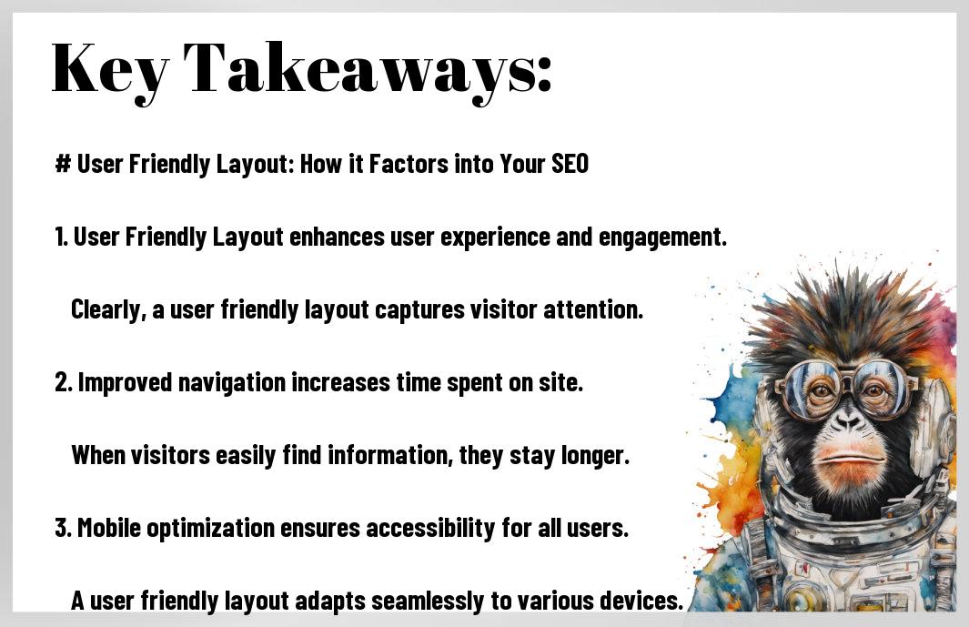
Key Takeaways
Build a User Friendly Layout That Ranks and Converts
A user friendly layout is not a design luxury — it is the single most impactful investment you can make in your website’s long-term SEO performance, conversion rates, and brand credibility. Every element covered in this guide — from navigation architecture and visual hierarchy to mobile optimization, page speed, accessibility, and continuous measurement — works together to create a compounding performance advantage over competitors who treat layout as a cosmetic afterthought.
At Rank Authority, we specialize in translating user friendly layout principles into measurable search rankings and business results. The sites that dominate their categories do not just have great content — they have great content delivered through layouts that make it effortless for every user to engage, trust, and convert.